› Forums › Tenchi Muyo! Discussion › Anime › Art Evolution
- This topic is empty.
- Post
-
- October 7, 2012 at 7:04 AM
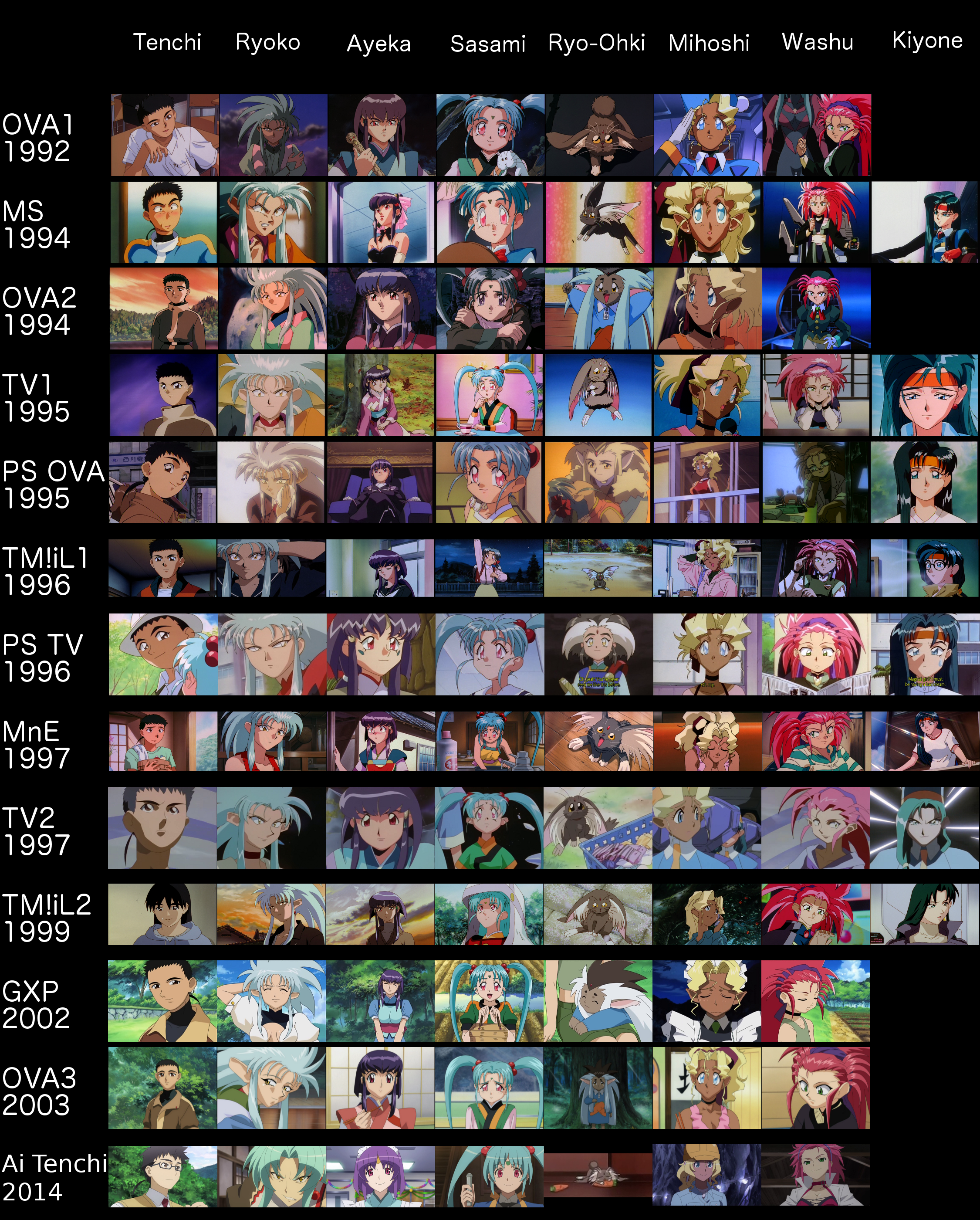
As promised, I have produced a collage of screenshots from the different incarnations of Tenchi Muyo!to see how the character designs have changed over the years. 

While the overall designs are fairly consistent, there have been noticeable trends. For example, many have noted that Ryoko’s ears have grown in size over the last 20 years. What other trends have you noticed? What effect has the introduction of CG had on the designs? What are your thoughts?
- Replies
-
-
- October 7, 2012 at 9:41 PM
*shrug* Mihoshi’s ears (round vs pointed), Kiyone’s hair style and colouring… Tenchi’s face pretty much always looks the same. I don’t really like what CG has done to the series, from Ryoko’s ears to the backgrounds becoming to… shiny and fake looking. Shading is weird. Good job, Pii
")
-
- October 7, 2012 at 10:46 PM
You can tell after TMIL2 they went to a round kind of bloated cheeks and jaw design for everyone in GXP and in OVA3 they overdid the eyes, but tried to return to the sharper jaw lines. Of anyone, Mihoshi’s the closest to normal from OVA 3. There’s a definite brightness increase too for the new stuff when they left behind hand drawn. Some of the Pretty Sammy and TiT stuff is the largest departure from the old material, but it’s still respectably close. Ironic it seems that Ryo-ohki’s humaniod form seems to have originated in PS.
Hey Pii… no love for Dual Kiyone from 1999 ?
-
- October 7, 2012 at 11:42 PM
I actually did enjoy the basic art style that was used in OVA 3 with two notable exceptions: as stated already, the eyes were overdone (sight-gags specifically) and Ryoko’s ears. She sounds like Kyle’s mom and looks like a cow. Anyway, I think the TMiL 2 art design is my favorite because, to me, the characters seem to have the most natural look in that incarnation. -
- October 8, 2012 at 12:43 AM
My favorite(s) are OVA 1 & 2/Universe/TMiL1 (they’re all basically the same). I’m an originalist though, so I almost always prefer the original anything. -
- October 8, 2012 at 9:02 AM
JGZinv wrote:
Some of the Pretty Sammy and TiT stuff is the largest departure from the old material, but it’s still respectably close.Ironic it seems that Ryo-ohki’s humaniod form seems to have originated in PS. I’m pretty sure the OVA episode was first, so it would be the other way around, especially since Ryo-Ohki’s male form has pale/white skin (which reflects Ken-Ohki as a male cabbit whose grey/white) but I wouldn’t put that thought past Kajishima “Ooo I like that design, I’m going to
be influenced by it then take credit for it” lol On the subject of the designs, everything is pretty good, of course until we get into post 2000 Tenchi, then it gets much too sterilized like many other anime for my own good. The one thing you can tell right away is which one had the highest production value, which was the Mihoshi Special. Tri-Shading was something you RARELY ever saw on anything but the most popular stuff (aka if you saw Tri-shading outside of Gundam, there was money), along with the attention to detail
Preferred designs for each character (I like them all but if I had to pick)
Tenchi:
Mihoshi SpecialRyoko:
UniverseAyeka:
OVA1Sasami:
OVA1Ryo-Ohki:
UniverseMihoshi:
Mihoshi SpecialWashu:
TMiL1Kiyone:
UniverseLargely I think Universe had the best designs because of how they portrayed the characters in the series, they were very “core” versions of themselves, which lent themselves to design.
-
- October 8, 2012 at 8:42 PM
Kiyone from TMIL was my favourite design. TU but with more funding. It was the same style but near OAV’s quality. So I was a happy fan seeing her with more shading and detail. TU Kiyone is my next favourite design.
Her OAV design is my 3rd favourite. It’s mostly to do with her eyes. Whilst other characters had black pupils (did I get that right? Usually get mixed up) hers was a dark green and when looked from a distance it looked like it blended in. However I do love her GP uniform in the Mihoshi special. Those shoulderpad things were great. The black under clothes made her look badass, and made the outer uniform stand out alot.
No brainer I find her Tokyo art the worst. Don’t need to explain.
HEr PS TV series artwork is right above Tokyo in worst artwork. Her eyes looked odd here..
Whilst I wasn’t a fan of her TMIL2 artwork, it DID make her look more mature (aka older, but not old old xD). The hairstyle she had on with that suit really suited her too.
However, Pii you forgot the Evil Kiyone from the MS ending credits.


Or we could use THIS (its that Evil Kiyone with her normal teal hair) :Tenchismile:
http://s181.photobucket.com/albums/x5/KiyokaMakibi/?action=view¤t=EvilKiyone.jpg -
- October 8, 2012 at 9:59 PM
-
- October 8, 2012 at 10:03 PM
Dagon123 wrote:Kiyoka wrote:
However, Pii you forgot the Evil Kiyone from the MS ending credits.He didn’t use anything that didn’t have the full range of the cast in it
But the MS ending had the same quality as the MS isawitplz
Besides, if you want to be like that then Kiyone wasn’t in any OAV series yet he stil included them :Cheeks:
-
- October 9, 2012 at 12:27 AM
Kiyoka wrote:Dagon123 wrote:Kiyoka wrote:
However, Pii you forgot the Evil Kiyone from the MS ending credits.He didn’t use anything that didn’t have the full range of the cast in it
But the MS ending had the same quality as the MS isawitplz
Besides, if you want to be like that then Kiyone wasn’t in any OAV series yet he stil included them :Cheeks:
Continuity didn’t matter, the reason he did it and what show’s he picked were what showed the main cast as a whole, hence why Dual wasn’t included, or any of the other fringes, because they never focused on the main cast and how they changed with each production. :Tenchismile:
-
- October 9, 2012 at 3:30 AM
Dagon123 wrote:JGZinv wrote:
Some of the Pretty Sammy and TiT stuff is the largest departure from the old material, but it’s still respectably close.Ironic it seems that Ryo-ohki’s humaniod form seems to have originated in PS. I’m pretty sure the OVA episode was first, so it would be the other way around, especially since Ryo-Ohki’s male form has pale/white skin (which reflects Ken-Ohki as a male cabbit whose grey/white) but I wouldn’t put that thought past Kajishima “Ooo I like that design, I’m going to
be influenced by it then take credit for it” lol On the subject of the designs, everything is pretty good, of course until we get into post 2000 Tenchi, then it gets much too sterilized like many other anime for my own good. The one thing you can tell right away is which one had the highest production value, which was the Mihoshi Special. Tri-Shading was something you RARELY ever saw on anything but the most popular stuff (aka if you saw Tri-shading outside of Gundam, there was money), along with the attention to detail
Preferred designs for each character (I like them all but if I had to pick)
Tenchi:
Mihoshi SpecialRyoko:
UniverseAyeka:
OVA1Sasami:
OVA1Ryo-Ohki:
UniverseMihoshi:
Mihoshi SpecialWashu:
TMiL1Kiyone:
UniverseLargely I think Universe had the best designs because of how they portrayed the characters in the series, they were very “core” versions of themselves, which lent themselves to design.
Alright, I must not have the same artistic eye as everyone else. I look at OVA 1 & 2, MS, TU, and TMiL1 and see basically the same designs…?
The only real differences I ever saw were between all of the above, OVA 3, MNE, and TiT. I do see a little bit of a difference in OVA 2, but really only in terms of coloring. And Tenchi’s design. Sorta.
0n0plz
-
- October 9, 2012 at 4:56 AM
Mittens wrote:Good job, Pii
Thanks, Mittens. ^^V
JGZinv wrote:Hey Pii… no love for Dual Kiyone from 1999 ?
Kiyoka wrote:However, Pii you forgot the Evil Kiyone from the MS ending credits.
Dagon123 wrote:Continuity didn’t matter, the reason he did it and what show’s he picked were what showed the main cast as a whole, hence why Dual wasn’t included, or any of the other fringes, because they never focused on the main cast and how they changed with each production. :Tenchismile:
Dagon’s pretty much right in how I chose images. I was looking for a good, if not great, still of each character from the particular incarnation. The idea was to find an exemplary example of each art style for each character. That’s why there’s no chibi nonsense or wild takes from Shin/TV2/Tokyo, PSTV, or GXP. I realize those art styles got bad often, but that wasn’t the focus of this project.
Also, this collage is biased by my preferences, which is why Evil Kiyone isn’t there. Frankly, I like my teal-dressed GP detective better than the black-haired villainess.

As for Kiyone’s very brief appearance in
Dual!, I honestly forgot about it, but that still isn’t exactly far removed from her design in PSTV, particularly considering Ramia and Misao standing right next to her. Also, the other Tenchimain cast members aren’t there, as Dagon mentioned. I meant no slight to Dual!or its fans. To my favorites, I’d have to go with the following. Please note that this is highly biased and probably influenced by characterization.
Tenchi: I liked his look in TM!iL1, but the mature look from TM!iL2 trumps it. I’d like to see the latter in combat, like a boss. fyeahplz
- Ryoko: This is easily TM!iL2, except for the damned ears. The leather jacket just works for me. awesomeglassesplz
- Ayeka: As much as I like OVA1, I dig the detail and shading she got in OVA2. If I could get a blend of her TM!iL2 design with OVA2, I’d be a very happy mathematician. berwaldplz
- Sasami: Like with Ayeka, I really liked the detail in her design from OVA2, but letting her hair down in TM!iL2 made her actually look older. Honestly, I’d like to see her actually grow up, rather than being eternally typecast as a child. imdarkplz
- Ryo-Ohki: For the cabbit form, I’d go with MnE’s movie-grade art. For humanoid, I definitely approve PSOVA. Someone should recycle that for Ken-Ohki… oh wait. evulplz
- Mihoshi: I’m going with OVA1, when she wasn’t a sight-gag. isawitplz
- Washu: Meet in the middle between OVA2 and TM!iL1, and we’ve got a deal. :Happy/:
- Kiyone: I like the sharpness of her design in MS, which adds to her no-nonsense personality there. :dexter:
-
- October 10, 2012 at 3:46 AM
AIC is the only anime studio that initially releases splendid character designs, only for them to exponentially get worse. While Tenchi’s was more slow and gradual, Ryoko’s hair in TF… looks like the coat of a lap dog. -
- October 10, 2012 at 7:47 PM
Personally I like the character designs of the first two OVAs, and Tenchi Universethe most. I also have a soft spot for the character designs of
Tenchi in Tokyo, and I feel that the designs get a lot of unfair hate. I also wonder what Yugi would look like in the OVA and TU art styles. I have mixed feelings on the character designs in
Tenchi Forever, and I dislike the OVA 3 character designs. -
- October 23, 2012 at 6:49 PM
Jabberwocky wrote:Dagon123 wrote:JGZinv wrote:
Some of the Pretty Sammy and TiT stuff is the largest departure from the old material, but it’s still respectably close.Ironic it seems that Ryo-ohki’s humaniod form seems to have originated in PS. I’m pretty sure the OVA episode was first, so it would be the other way around, especially since Ryo-Ohki’s male form has pale/white skin (which reflects Ken-Ohki as a male cabbit whose grey/white) but I wouldn’t put that thought past Kajishima “Ooo I like that design, I’m going to
be influenced by it then take credit for it” lol On the subject of the designs, everything is pretty good, of course until we get into post 2000 Tenchi, then it gets much too sterilized like many other anime for my own good. The one thing you can tell right away is which one had the highest production value, which was the Mihoshi Special. Tri-Shading was something you RARELY ever saw on anything but the most popular stuff (aka if you saw Tri-shading outside of Gundam, there was money), along with the attention to detail
Preferred designs for each character (I like them all but if I had to pick)
Tenchi:
Mihoshi SpecialRyoko:
UniverseAyeka:
OVA1Sasami:
OVA1Ryo-Ohki:
UniverseMihoshi:
Mihoshi SpecialWashu:
TMiL1Kiyone:
UniverseLargely I think Universe had the best designs because of how they portrayed the characters in the series, they were very “core” versions of themselves, which lent themselves to design.
Alright, I must not have the same artistic eye as everyone else. I look at OVA 1 & 2, MS, TU, and TMiL1 and see basically the same designs…?
The only real differences I ever saw were between all of the above, OVA 3, MNE, and TiT. I do see a little bit of a difference in OVA 2, but really only in terms of coloring. And Tenchi’s design. Sorta.
0n0plz
the only character I really notice a difference in between the OVA and TU is Washu. In the OVA she’s an adult in the body of a child. Whereas in Universe, she actually appears to be a pint sized adult (note the chest)
-
- October 24, 2012 at 6:28 PM
I haven’t noticed but thanks for the heads up.When I get around to re-watching Tenchi I will try to see the difference in Washuu’s *AHEM* assets between the first OVA and Universe.
-
- October 28, 2012 at 11:18 PM
Hey Pii, will you make a version with the Manga versions put in as well? -
- March 18, 2013 at 7:32 AM
While I have not completed a manga comparison table, a discussion in mini-chat a week ago spawned this little image. ^.^v 

Debate was had about exactly what happened with Ryo-Ohki’s ship configuration throughout the OVA continuity. I did not include the other continuities as this image was made explicitly to address the following issue.
Series 1 has the well-known design, which appears in almost every medium of
Tenchi, for two episodes. Then, after Kagato appears, Ryo-Ohki grabs onto Ryu-Oh’s core unit and produces a new form in Episode 5. From the climax of the episode, Ryo-Ohki is heavily damaged, as seen in Episode 6. This new form is called “New Ryo-Ohki” in the following piece of production art for Series 1, which I acquired years ago. 

Now, OVA Series 2 reverts Ryo-Ohki back to her original configuration, both in the opening and in Episode 5 while storming the
Shunga. Years pass, and Ryo-Ohki reappears in GXP episode 15, sporting a CG version of her configuration from the end of OVA Series 1. o.o; This form is used throughout OVA 3 and in her brief appearance in SKT/WoG.
So, exactly what happened to Ryo-Ohki in Series 2? Did she just decide to use her old battleship form for kicks? Was this a lapse in continuity by the artists?
… Oh, and here are some other goodies from my personal vault of production images. ^^v


-
- March 18, 2013 at 6:01 PM
That red ship in the last group of images reminded me of the Shadow Ships from Babylon 5. -
- August 16, 2013 at 12:43 AM
-
- August 16, 2013 at 12:55 AM
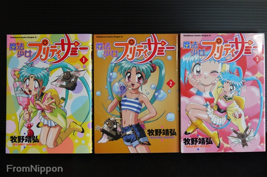
shades of blue wrote:The chart is missing a series thou, the 3 volume Pretty Sammy manga by Yasuhiro Makino
I don’t think the chart was meant to include everyone, just the more important people associated with Tenchi and the main cast (otherwise every doujin author on the planet could be here) and Yasuhiro isn’t one of those people, nor does his work encompass that criteria.
-
- August 16, 2013 at 1:22 AM
I suppose, however without it there’s nothing to represent Pretty Sammy on that chart and the first chart did include Sammy TV. Also while if did not occur to me, Kuroda Yosuke is missing too. Unlike Yasuhiro, Kuroda had very extensive involvement with Tenchi & Sammy. -
- August 16, 2013 at 2:25 AM
shades of blue wrote:The chart is missing a series thou, the 3 volume Pretty Sammy manga by Yasuhiro Makino.
Dagon123 wrote:I don’t think the chart was meant to include everyone, just the more important people associated with Tenchi and the main cast (otherwise every doujin author on the planet could be here) and Yasuhiro isn’t one of those people, nor does his work encompass that criteria.
shades of blue wrote:I suppose, however without it there’s nothing to represent Pretty Sammy on that chart and the first chart did include Sammy TV. Also while if did not occur to me, Kuroda Yosuke is missing too. Unlike Yasuhiro, Kuroda had very extensive involvement with Tenchi & Sammy.
Actually, Dagon’s correct in my initial purpose. I had no idea that Kuroda Yosuke existed before you mentioned the artist just now. I went with those five mainly as they were the ones I knew the best and could easily obtain. I meant no slight to any particular artist or series.
If you have scans of other works and would like to contribute, feel free. ^^v I certainly do not have a monopoly on this thread.However, I would like to raise the point that Okuda actually has done adaptations of both
Pretty Sammy(NNFT Vol. 3) and TM!iL1(NNFT Vol. 7), so both do have representation if not solely or directly. SnowQueen wrote:I really like all the styles
As to the “Eternal Memory” companion manga to
TM!iL2by Negishi, it was said earlier in this thread -
- August 16, 2013 at 3:15 AM
shades of blue wrote:I suppose, however without it there’s nothing to represent Pretty Sammy on that chart and the first chart did include Sammy TV. Also while if did not occur to me, Kuroda Yosuke is missing too. Unlike Yasuhiro, Kuroda had very extensive involvement with Tenchi & Sammy.
Not to keep shooting down what you’re bringing up, but it doesn’t look like Kuroda has done anything on his own in regards to Tenchi. Kuroda has been screenplay for the majority of the OVA line OVA2 onwards, but not an actual content creator himself, which is the emphasis on these, his style at best would just be a reflection of Kajishima’s and somewhat redundant to add, at least in my opinion.
-
- August 16, 2013 at 4:12 AM
Dagon123 wrote:shades of blue wrote:I suppose, however without it there’s nothing to represent Pretty Sammy on that chart and the first chart did include Sammy TV. Also while if did not occur to me, Kuroda Yosuke is missing too. Unlike Yasuhiro, Kuroda had very extensive involvement with Tenchi & Sammy.
Not to keep shooting down what you’re bringing up, but it doesn’t look like Kuroda has done anything on his own in regards to Tenchi. Kuroda has been screenplay for the majority of the OVA line OVA2 onwards, but not an actual content creator himself, which is the emphasis on these, his style at best would just be a reflection of Kajishima’s and somewhat redundant to add, at least in my opinion.
While it is true that Kuroda was just the co-author of OVA2/OVA3/GXP/101/TTM/GXPGaiden, Kuroda also adapted
PhotonPretty Sammy -
- August 17, 2013 at 3:18 PM
I think OVA 3’s art style looks hideous, what is up with Ryoko’s ears? I always preferred OVA 1 & 2 and TU’s art design. The movies looked good except for MnE in my opinion but acceptable. TMIL2 looked radically different like a more realistic design but looks good.
Basically I’m old school
-
- August 22, 2013 at 8:39 PM
Thanks for the hard work pii! It really turned out great, and will be a nice resource to turn to in future Tenchi art style conversations 
Thanks to everyone else for chiming in too with suggestions and clarifications about other artists who have worked on Tenchi, some of whom I hadn’t even heard of before! It just goes to show that Tenchi really was a huge and highly collaborative entity in its day! Personally, I think I prefer Okuda’s style the best, although that may just be my personal bias peeking through
😉 -
- May 9, 2014 at 10:35 AM
-
- October 9, 2014 at 2:33 AM
Now that we have some images from Ai Tenchi, I have taken to making my comparison collages to show how things have evolved. ^^v In particular, notice the design of Tenchi’s house in throughout the years. 

Notice that in all OVA-related continuities, the roof of the house is blue, but in the TV and movie continuities, the roof is red. This may well be due to Achika’s influence. After all, in
Tenchi Muyo! in Love, she suggests to Nobuyuki that the roof be red, a suggestion he considers quite bold. ^.^ 

Also, notice that in OVA series 1, there is no extension to the third floor next to Tenchi’s room (i.e. the one with the skylight). One wonders if that was added due to the extra tenants.
qt1 Interestingly,
Ai Tenchiis using the design and coloration from “Night Before the Carnival”, rather than the larger post-series 1 OVA design or the red-roofed TV series design. What are your thoughts on the design choices? Tenchismile Another point of interest is Washu’s door in different incarnations of the series.


Overall, the designs are nearly identical. Notably, all the large post-series 1 OVA design have the stairs descending to the left of Washu’s door. However, the more classical design has a mix. Universe/iL1 both have the stairs descending to the right like “Night Before the Carnival”. Yet,
Tenchi in Tokyoand Ai Tenchiboth have the stairs descending to the left, like the large post-series 1 OVA design. This is odd as it would imply that those two are using the classical exterior with the newer interior. Are those compatible? wth2 What are your thoughts? -
- January 5, 2015 at 9:54 PM
Unfortunately the sign up for Dropbox obscures the Ai Tenchiart work. -
- January 6, 2015 at 4:08 AM
mitsuki lover wrote:Unfortunately the sign up for Dropbox obscures the
Ai Tenchiart work. You can close the signup dialog and right click on the image to download the full rsolution image. You don’t have to sign up. I checked to be sure of that before I posted the image.
-
- January 6, 2015 at 4:17 AM
-
- May 23, 2018 at 12:45 AM
As I’ve been reviewing the Ai Tenchimanga, I decided it was time to update some images. In particular, here is the manga comparison chart, now including Haruna Nakazato’s manga. I also included Momo and Beni because, if you’ve read the manga or watched the show, they are main characters in their own right. ^^v 

-


- You must be logged in to reply to this topic.